Thursday, November 16, 2017

Sunflower Still Life Inspired by Van Gogh


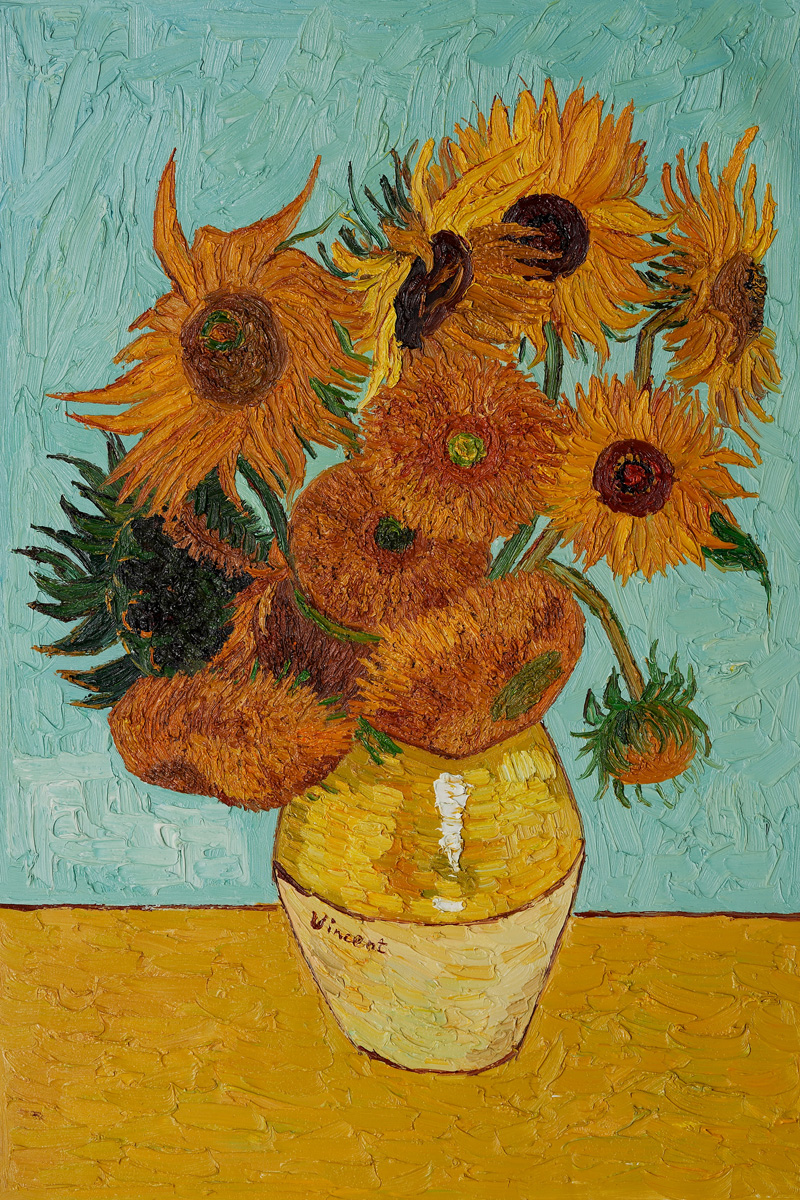
Sunflowers
1888
Oil on Canvas
Vincent van Gogh


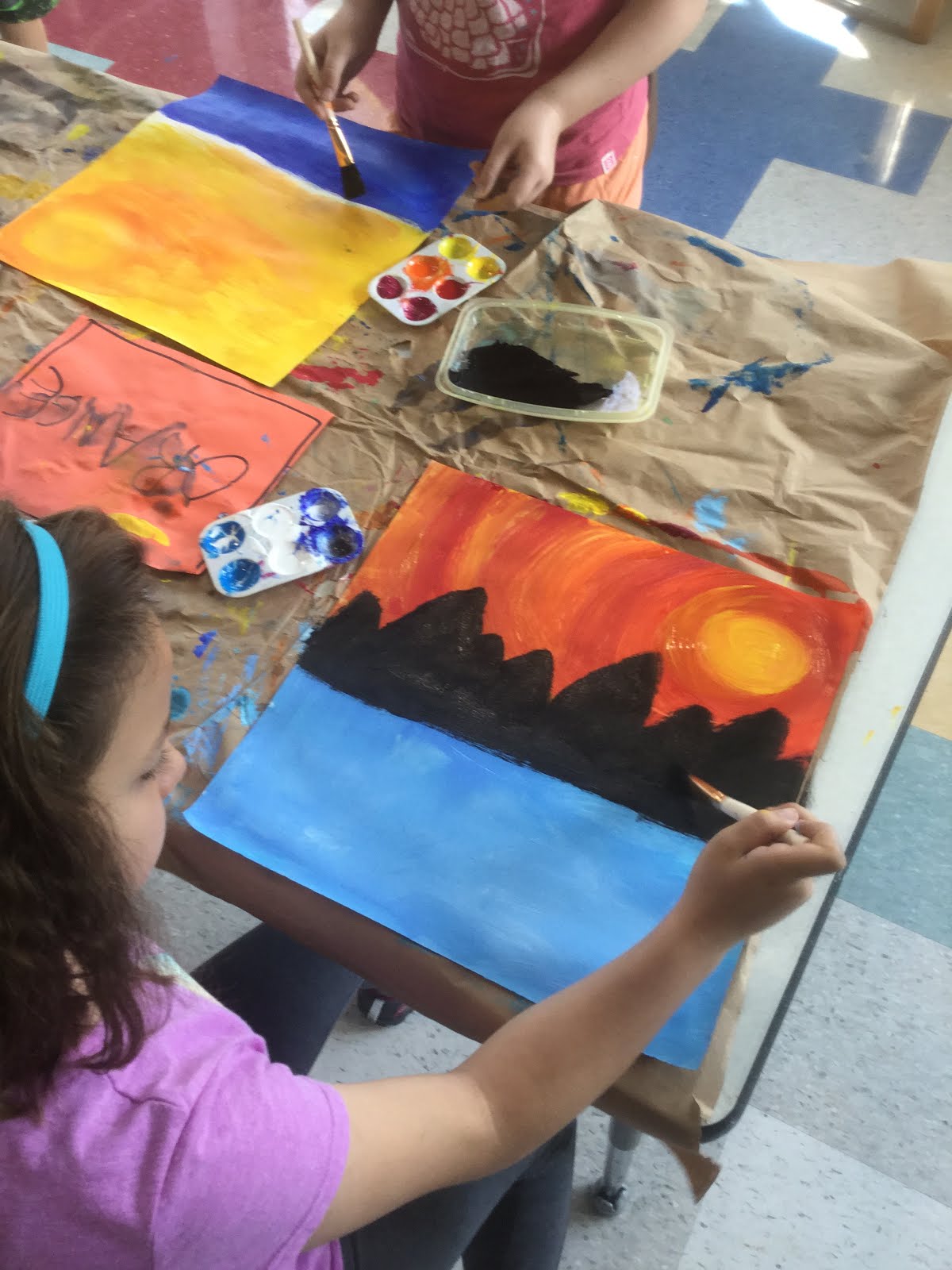
First grade students studies Vincent van Gogh's Sunflowers to draw inspiration for their own still life project.  Students began their art work by discussing the position of the vase and how there needed to be enough room for the sunflowers in their composition.  Using a black crayon, students used a template to trace a vase shape and add the essential line to separate table from background.  From there, students explored color value.  We talked about how Van Gogh used different shades of yellow in his painting to achieve depth.  If we add white to yellow, it produces a lighter tint of color.  When we add black to yellow, it creates a darker shade of yellow.  We explored this concept as students painted in their vases.  Similarly, we learned how to mix turquoise for the background color.  We mixed green, blue, and white to produce teal.  If we wanted a lighter tint of turquoise, students added white and if they wanted to a deeper color they needed to add more blue. 

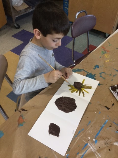
The second class we painted our sunflowers.  Students used brown for the centers of their flowers and then painted petals with yellow with out washing their brushed off.  This subtle mixing of yellow and brown added to the richness of their petals.  Students were also taught to make their petals by placing their paintbrush on the edge of the brown circle and then flick their wrist away to make their mark. 


The final class was devoted to cutting each sunflower and gluing them to their art work.  Students had to practice advanced cutting skills so that their flowers didn't look like lollipops rather students had to cut around each petal.  It took a lot of effort but their hard work paid off!  Lastly, students added paint and oil pastels to create stems and details to their work. 


The final results are stunning!  Great job 1st graders!!

Monday, November 13, 2017

Secondary Colors Monster Trucks


Kindergarten students explored secondary colors along with line, shape and painting by creating these awesome monster trucks.  Students began by listening to the story, I Stink by, Kate and Jim McMullen to draw inspiration for making a monster truck.  Students worked on their trucks by  painting a rather large rectangle in the center of their paper followed by adding circles for wheels and more rectangles, squares and triangles for their trucks design. 

The next class, students used a secondary color, (green, purple or orange) to fill in their trucks and experimented with color value by switching to a new shade of color inside each shape of their truck.  While half the class was painting their trucks, the other half was experimenting with mixing primary colors to get their secondary color by using toy trucks to paint with.  It was so much fun!


Look at those wheel go!  Red + Blue = Purple!

Vroom vroom!  Yellow + Red = Orange
The last day was to put all the pieces together.  Students made a frame of black paper and yellow dotted lines to represent roads going around their art work.  Student then glued down tissue paper  to add some texture to their composition.  Lastly, students cut our their trucks and glued them onto the paper.


Thursday, October 12, 2017

BIG Line Faces

Sandra Silberweig

Sandra Silberzweig is a Canadian born artist who uses bold colors and lines to capture life around her.  Students started this project by identifying all the lines they could see in Sandra Silberzweig above portrait. We found the following lines:
Horizontal
Vertical
Diagonal
Spiral
Zig-zag
Curved
Dotted
Bumpy... just to name a few!
We then set off to work by using those line and FILLING our paper.  We mapped out a face starting with the nose, chin, neck, eyes, lips and then adding lots and lots of patterns in details.
   
Next, students used two layers of color to their faces.  They began by using oil pastels to add texture and bold sections in their work.  This was then followed with painting with tempera cakes.  We focused on using lots of water to help s-t-r-e-t-c-h the color across the paper.  
   
Absolutely stunning when you see all the faces together!


Three Primary Colors


Kindergarten students began the year with an introduction to the primary colors.  We watched the above video to gain some background knowledge with this very catchy tune!  We then set off to use the primary colors by painting in sections of their paper yellow, red, and blue.
   
 In this lesson we focused on how to use a paintbrush properly, and how to clean our brushes before switching colors.
 
The next week, we talked about lines and patterns.  Students used a white oil pastel to add line details to their artwork.  This was then followed by some stamping exploration using various size circles from yogurt cups to marker caps.  Students made circle designs across their paper trying to make their mark in each of the primary color sections.
 
Bravo to a job well done!


Andy Warhol Inspired Hand-prints


First grade students began the year with art work inspired by Pop Artist, Andy Warhol.  We talked about turning the ordinary into extraordinary art with the help of repetition and bold colors. Student then folded a 10x10 piece of paper into fourths to get 4 equal squares to use.  Students then traced their hand-print four times trying to rotate their hand in a new direction in each box.  Then came the fun... we stamped their hand-prints on top!  The next week, students then practiced their painting skills by painting in the inside of their hand-prints with four different colors.  Then students moved onto painting the backgrounds making sure they switch colors to make the print "pop"!


The final results definitely, "POP!!"

Jasper Johns Alphabet

Jasper Johns
Colored Alphabet, 1959
Oil and Collage on panel

Third grade students used the above painting, Colored Alphabet by, Jasper Johns to draw inspiration for their own artwork.   Students initially saw this painting as an "easy project" because they already knew how to write their letters.  However, once students got started, they began to appreciate how complicated and difficult it is to fit all the letters of the alphabet in their paper and use the right size letters which aren't too big or too small.  We brainstormed tools that we could use to help with the drafting process and decided a ruler would help to section off their paper.  We placed 5 horizontal lines across the paper and did some math to decide how many letters should be placed on each row.

Once the students had their alphabet laid out in pencil, they began work on making a patchwork of color for the background layer.  Students used tempera cakes for this process and were allowed the freedom to color their paper in any pattern they desired.
   
Painting the letters in different colors.  Students were directed to use red tempera paint for 5 letters of their choice in their alphabet before switch colors to blue, green, yellow, then white.
     

The next class, students used oil pastels to make expressive lines and textures to jazz up their artwork and camouflage the alphabet into the canvas. 

   
LOVE, LOVE, LOVE how this class rocked Jasper John's!!!
   

Clipper Ships, Ahoy!


In conjunction with Columbus Day, 5th grader students embarked on a nautical journey working on bringing a clipper ship to life.  I drew inspiration from the fabulous blogger Deep Space Sparkle for this project.  Students began their technical drawing using nothing more than pencil, ruler and eraser.  We paid close attention to the details of a clipper ship and observed each vessel has to have these essentials: a hull,  masts (3 of them) and sails (at least 9 on each boat).
   
Once the clipper ships were complete, students traced over their boats with black marker and used water colored pencils to add color to their ships.  
   
After the ships were complete, students began to work on their seascape.  We used warm colors for the sky and cool colors for the water. Then we added land on the horizon by diluting black paint and making an organic line across the paper.  


Finally, it's time to put all the pieces together!  I encouraged students to partially glue their clipper ships onto the background thus giving the appearance of wind actually catching its sails.  Some finishing touched included, fluffy clouds and cresting waves. 
I must say the final pictures are quite impressive!